
Posted on June 29, 2008
A typical visualization pipeline can be modeled as follwing diagram.
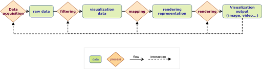
- Data acquisition: Collect data from various resource. For example, A temperature sensor.
- Raw data: The raw data is the information resource. It may not be manipulated directly by visualization applications.
- Filtering: Filter and organize desired data.
- Visualization data: After proper filtering the data should be stored with specific structure which can be easily manipulated by visualization applications.
- Mapping: Map the "informational" data to "displayable" or "render-able" data representation.
- Rendering representation: Describe the visualize-able attributes of data. For example, color, size, position...etc.
- Rendering: Render render-able data onto visualization output media. This process takes care the rendering effect which depends on visualization output media.
- Visualization output: Where humane or any actor can perceive and recognize.
- Interaction: A good visualization application should provide many possible interactions. The interaction can change any visualization process online or offline.
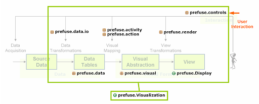
One of the most important contents from the prefuse official site may be the following figure.

Reference model diagram from http://prefuse.org/
This reference model describes the pipeline flow in the prefuse toolkit.
- Source data: The input resource of information (raw) data. It can be from database, spreadsheet or other media. The source data is outside the prefuse applications scope (not as prefuse internal data).
- Data transformation: Load source data into prefuse internal data tables.
- Data tables: Prefuse internal data structure for data storing and manipulation. Data will be stored in tables (similar to a simple database table). Prefuse has built-in ability to store data with tree or graph semantics in tables.
- Visual mappings: enrich "informational" data with "visualize-able" attributes
- Visualization abstraction: The visualize-able attributes for data. Prefuse organizes visualization abstraction also in the tabular manner, so that prefuse can manage both information data and visualize-able attributes in internal data table structure.
- Visual transformations: Do final visualization rendering of the visual abstraction on output views. We can say: Visualization abstraction define what to be displayed; Visual transformations decides how to display.
- Views: Prefuse use Swing as its visualization view (display) media.

Before further exploration of prefuse, I would like to show a common example which demonstrates the visualization scenario in prefuse.
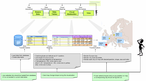
- Source data: The input weather data is stored in database.
- Data transformation: Load desired source data from database and store them in prefuse internal data structure, i.e. data tables.
- Data tables: The weather data is stored in a tabular manner. It can be retrieved like a database table, for example, with a query expression.
- Visual mapping: Assign extra visualization attributes to the data.
- Visual abstraction: Extra visualization attributes, e.g. position, shape, size or color to display for specific city. Such attributes are also stored in tables which are extended from the data tables.
- View transformation: Render those visual abstraction onto displayable media. This process may render some artifacts which are not necessarily defined in visual abstraction.
- View: It may be a Java Swing panel which is displayed on LCD.
- Interactions: Use may use mouse to do interaction on Swing panel, for example, to click somewhere on map. The application should calculate corresponding city, load necessary data, assign new data with visualization attributes and update the display.

0 comments:
Post a Comment